
Audience attention is the currency of today’s digital world, and companies are competing fiercely to capture it. But what happens when user pathways feel like a maze, interfaces are cluttered, or pages are slow to load? We lose customers.
As data suggests, a poorly designed user experience (UX) affects brand perception at every stage of the product interface. WebFX statistics reveal that “89% of customers will use a competitor after a poor user experience.” So, how can we prevent this?
In this article, we’ll examine some examples of poor UX practices and explore ways to improve them, boosting your product’s potential for business success.
Table of Contents
What Is Bad UX Design, and Why Does It Matter?
Bad UX refers to a product interface that’s confusing, difficult to navigate, or unintuitive, leading to user frustration and dissatisfaction. A common outcome of poor UX design is shopping cart abandonment in e-commerce, often due to inefficient transaction processes or subpar performance.
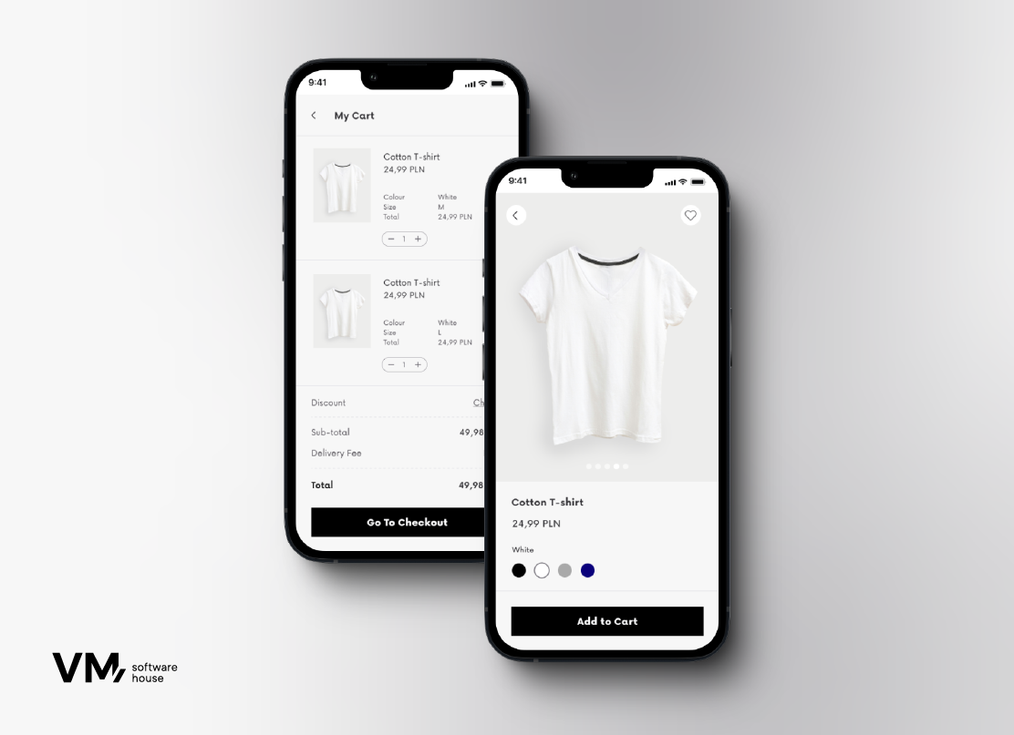
According to the Baymard Institute, the average shopping cart abandonment rate is over 70%, with poor UX being a significant cause. Some of the main reasons users abandon their shopping carts include:
- Requirement to create an account (26%)
- Lack of trust in the site’s handling of credit card information (25%)
- Long or complicated transaction processes (22%)
- Inability to view the total order cost upfront (21%)
- Website errors or crashes (17%)
For large enterprise software, the stakes are even higher. A poorly designed interface can lead to significant business losses due to user mistakes, extended implementation and training periods, or increased support needs. Over time, ineffective UX at the organizational level can drive companies to switch to competitor products.
A widely known example is Citibank, whose poor UX design contributed to a $500 million loss. In a high-profile incident, employees accidentally transferred $900 million to a client’s creditor instead of the intended $7.8 million. Despite Citibank’s “six-eyes” security protocol and review by three experienced users, the flawed software design led to approval of the erroneous transaction.
While this case is exceptional, the costs of poor UX—both financial and reputational—are real and preventable.
Learn more about design solutions for enterprises in the article: Why Upgrade UI/UX Design for Legacy Enterprise Applications?
Consequences of Poor UX on Product Success
Bad UX affects business operations and profitability in multiple ways. Understanding these impacts is essential for supporting a superior user experience.
1. Decline in User Engagement and Retention
Poor UX often decreases user engagement, making customers less likely to return to a product that fails to meet expectations.
2. Increased Bounce Rate and Abandoned Sessions
High bounce rates indicate that users see little reason to stay on a site or app due to complex navigation, slow loading times, or poorly organized content that prevents them from finding what they need efficiently.
3. Low Customer Satisfaction and Negative Brand Perception
Dissatisfied customers are unlikely to recommend a product, resulting in critical online reviews that damage brand perception. Studies show that a positive user experience leads three-quarters of users to recommend a product to six others, while negative experiences may prompt them to share their discontent with up to 15 people.
4. Higher Customer Service Costs Due to Frustrated Users
Poor UX typically leads to more customer support inquiries as users encounter issues they can’t resolve alone, putting pressure on the support team and increasing operational costs.
5. Reduced Conversion Rates and Lost Sales
A product’s success often correlates with its sales performance. Poor UX can disrupt the conversion path at critical stages, such as registration or checkout, leading to missed sales opportunities and decreased revenue.
How to Identify and Fix UX Errors in a Product?
The foundation of an effective interface lies in insights drawn from research, UX audits, and usability testing. By applying the right research methods, you can not only understand user needs but also pinpoint elements causing negative experiences. This approach benefits both existing products and new developments. By testing initial concepts and prototypes, you can validate ideas early, enabling improvements before final implementation, which leads to cost savings and a higher-quality final product.
1. User Research
UX research is fundamental to usability-focused design. Making design decisions rooted in data and user insights reduces the risk of costly mistakes. Understanding the target audience deeply—including their mental models, preferences, motivations, and goals—is crucial. Based on the product’s development stage and needs:
- Conduct Qualitative and Quantitative Research: Use in-depth interviews and surveys to gather user opinions. Engaging users in surveys or product testing sessions provides valuable feedback and identifies specific pain points.
- Leverage Analytics Tools: Tools like Google Analytics and HotJar reveal user interactions, highlighting areas of high engagement or those that may be overlooked. Analyzing session recordings and heatmaps allows you to follow the user journey step-by-step, pinpointing problem areas for redesign or simplification.
2. Minimize Cognitive Overload
According to Nobel laureate Daniel Kahneman’s concept of “cognitive ease” in The Traps of Thinking, specific factors influence how enjoyable and effortless a product feels to use. These include consistency, a clear layout, and a sense of familiarity and credibility. These include a repeatable experience, a clear layout, and a feeling of familiarity and truthfulness.
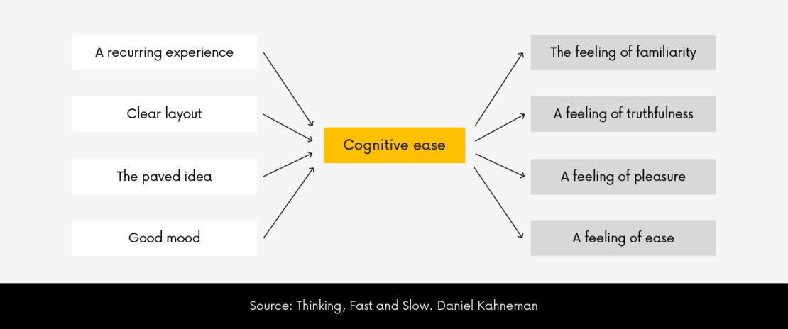
In digital product design, this means paying special attention to:
- Intuitiveness, Repetition, and Predictability: Designs based on familiar patterns make users feel instantly comfortable with an interface. Repeating consistent elements, like menu layouts and navigation methods, fosters “cognitive ease,” meaning users don’t need to relearn how to accomplish tasks, resulting in a smoother and more intuitive experience.
- Simplicity: Complexity can best be reduced by avoiding it from the start. Following Ockham’s razor principle—removing unnecessary steps, clicks, elements, colors, images, and decorative elements—is essential. Keeping the design streamlined helps users focus on the task at hand without distractions.
- Clarity of Layout (UI): In design, less is often more. Extraneous elements can create cognitive overload, as users can only process a limited amount of information at once. Overexposure leads to selective attention, causing phenomena like “banner blindness,” where users ignore certain elements of the interface. This can result in missing important features. Conversely, an aesthetically pleasing design enhances positive perception and can lead users to believe the product functions better (the “positive halo effect”). Users are more forgiving of minor usability issues when a design is visually appealing.
3. Iterative Design Process:
UX improvements are best achieved through an iterative process, where testing, feedback, and refinements continue until the ideal user experience is reached.
Best Practices for Creating a Positive UX Experience
Creating exceptional UX involves both analysis and practical experience. Here are key best practices:
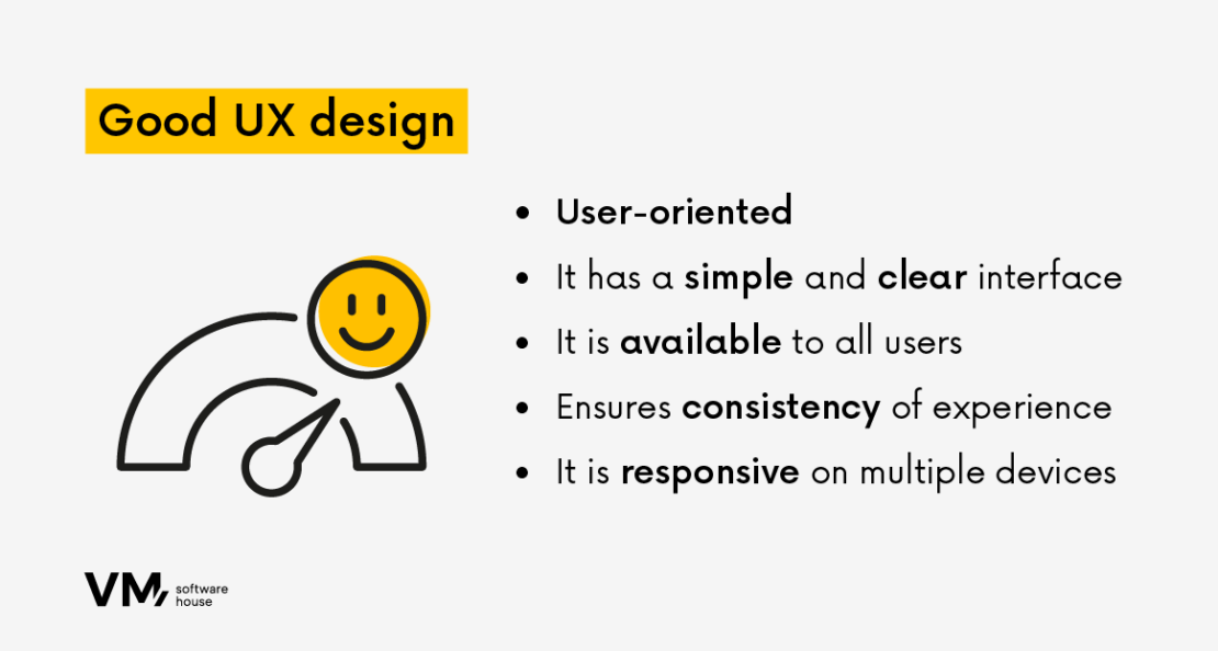
- User-Centered Design: Always design with the user in mind. Understand and empathize with their needs, preferences, and behaviors to create a relevant experience.
- Simplicity: Simplify interfaces to avoid clutter. Users should never feel overwhelmed by too many options or complex navigation.
- Accessibility: Ensure the product complies with WCAGstandards, making it accessible to all users, including those with disabilities. Accessibility broadens the user base and enhances public perception.
- Consistent Experience: Maintain consistency across the product for a seamless user journey from start to finish.
- Responsive Design: Ensure the product functions well on all devices, delivering the same high quality across platforms.
Case Studies: How Poor UX Affected Well-Known Products
A negative experience at any stage of user interaction can lead to an automatic association of negative attributes with a brand, impacting overall brand perception.
For instance, Adobe’s challenges with subscription cancellation, often associated with “dark patterns,” have led to hundreds of complaints on social media. Many users have expressed frustration, feeling as though Adobe “traps” customers into subscriptions that are difficult to cancel.
Common complaints include users thinking they signed up for a monthly contract when, in reality, they committed to an annual plan. One notable tweet detailed a designer being charged $291 for canceling an Adobe Creative Cloud subscription.
This information is hard to find on Adobe’s website, as the cancellation terms within the first year include a penalty fee—a fact that has undoubtedly hurt the brand’s reputation.
Eliminate Poor User Experiences: Make Your Product User-Friendly
Poor UX can damage your product’s success by creating frustration and dissatisfaction among users. Whether it’s an unreadable layout, lack of accessibility, or technical issues like poor responsiveness and slow loading, avoiding these missteps is essential to future project success.
To prevent these pitfalls, prioritize a UX design that deeply understands and reflects your audience’s needs. Auditing projects as part of development sprints can be a proactive way to detect and address UX issues early in the process. If you’re seeking a team of experts to elevate your digital product, contact VM.PL designers. We’re here to discuss your project and recommend optimal solutions.


